


Investing Strategy: Cyclicality
Some industries are cyclical. How can you use this cyclicality to your advantage?

A lot of industries are cyclical - they have good times and bad times. Understanding how your investments typically respond through an economic cycle is important to avoid panic selling and possibly help you judge whether or not a stock is demonstrating good value or not, given its position in the cycle.
As a general guide, typically time in the market beats trying to time the market. In this post, I showed that, more often than not, a lump sum investment left in the market for an extended period of time achieves more than adding funds at regular intervals. Therefore, although understanding the economic cycles can definitely be helpful, it may be a mistake to try and judge where the market is going to end up in the short term. The Efficient Market Hypothesis theorises that, at any time, the market responds to all available information and, therefore, the current price of a stock reflects the market participants’ best estimate of the true value of that stock.
Nonetheless, I personally believe that understanding cycles helps me judge whether or not I believe the time is right to add to one of my holdings.
Caterpillar (NYSE:CAT)
Caterpillar is my largest holding and is a typical cyclical stock. As the maker of high-value construction and mining equipment with limited useful lives, its customers will typically replace equipment when business is good (e.g. when commodity prices are high), but extend the use of existing equipment when business is not so good. In accordance with Keynesian economic theory, governments will often increase infrastructure spending in recessions to attempt to generate jobs growth, which also brings high-value contracts in to construction firms, which will roll down to machinery and equipment manufacturers like CAT.
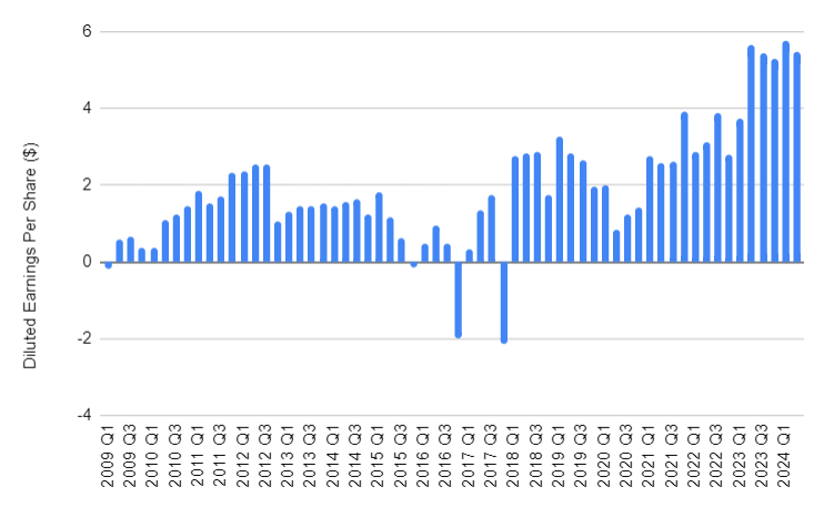
Earnings History
Caterpillar’s quarterly diluted earnings per share over the last 15 years are shown in Figure 1. The first point to note is that CAT’s earnings have generally been positive throughout this period. There have been 4 quarters with negative diluted earnings in the sample - 2009 Q1, i.e. around the time of the Great Financial Crisis, and then three occurrences of Q4 earnings being negative in consecutive years (2015, 2016, 2017). The second point to note is that there is a general upwards trend in earnings, with quarterly earnings of less than $1 per share in 2009, to over $5 per share in 2023 and 2024, but the earnings are bumpy, with frequent troughs, implying cyclicality.
Patterns in Earnings
To normalise these earnings, I have converted each year’s annual earnings into an equivalent quarterly average, and then compared the actual earnings per share (EPS) for each period against that quarterly average. With this approach, I am looking to see whether there is an obvious trend with earnings being higher or lower than average in any of the four quarters in the financial year. The results are shown in Figure 2 and Figure 3. Figure 2 shows a cyclical trend in earnings, with earnings rising from 2009 / 2010 to 2012, falling back to close to zero in 2016, before rising again, with a dip in 2020.


Figure 2 also shows that CAT can often have a bad quarter, sometimes really bad, enough to offset the positive contribution from the other 3 quarters (as experienced in 2016 and 2017).
Figure 3 shows that earnings per share in Q1 and Q4 tend to be lower than in Q2 and Q3. Statistically, there is evidence that Q4 tends to be lower on average than either Q2 or Q3, while the other quarters are not statistically distinguishable from each other
N.B. for the statisticians, I know I am taking a slight liberty with this assertion, because there is also evidence the variability in Q4 is higher than in other quarters, but I’m choosing to gloss over that element of the Analysis of Variance (ANOVA) assumptions, as I don’t believe it changes my conclusions.
Pattern Analysis (Autocorrelation)
There is a mathematical tool called autocorrelation, which is useful to trying to identify repeating patterns within a dataset. This tool calculates the correlation between a set of data and the same data, but offset in time. When the data highly correlates with itself, but with some kind of offset, it means there is a repeated pattern in the data.
As an example, here is the classic repeating pattern - a sine wave, like a pendulum swinging back and forth. It clearly repeats every 360⁰.
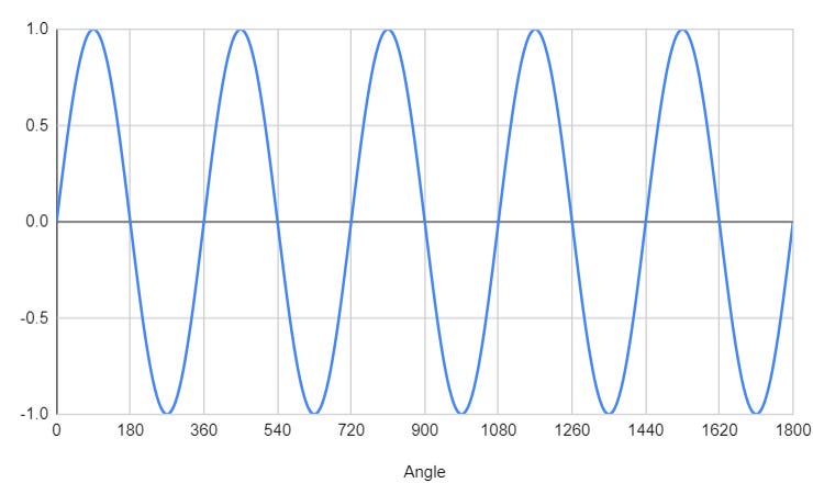
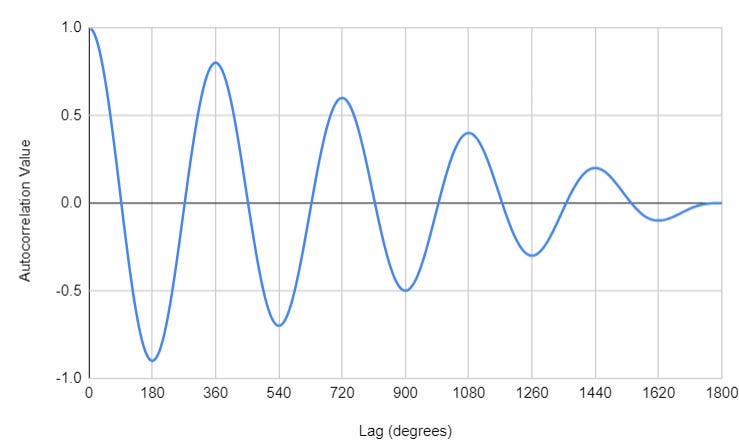
When the autocorrelation of this signal is calculated, it is clear that the correlation value is highest every 360 degrees and lowest every 180 degrees (with the absolute value decaying as there are fewer data points available with longer lags), proving the originally observed cyclicality. A highly negative value for the correlation coefficient indicates there is still a correlation, but the data is as mis-aligned as possible. Autocorrelation coefficients sit between 1 and -1, with strong correlations tending to either 1 or -1.
Autocorrelation of CAT’s earnings
So what patterns appear to be present in CAT’s earnings? Figure 6 provides some insight. Autocorrelations have been calculated for the absolute earnings per share data by quarter, as they have for average quarterly earnings, and the differences between absolute EPS and the average quarterly earnings (the ‘Delta’ data set).

The first thing to note is that autocorrelation coefficients are low, often around 0.1 or less, meaning there isn’t strong correlation between the actual earnings over time - they may increase or decrease in absolute value (as we might hope, as we generally want earnings to increase with time).
Secondly, earnings per share and average quarterly earnings do show some evidence of a pattern, with the highest positive values being shown with a lag of between 12 and 16 quarters, and between 40 and 44 quarters. In other words, the strongest similarity is seen with earnings data roughly 4 years apart, and roughly 10 - 11 years apart. However, the absence of positive correlation at around 8 years’ lag means that it can’t be assumed that CAT reliably demonstrates a roughly 3 - 4 year cycle. It seems like the last cycle was 4 years long, but the previous cycle was 10 - 11 years long. This can be seen in Figure 2 as local minima in earnings per share in the years 2020, 2016 (4 years prior) and 2009 (11 years prior). It is worth noting that, except for 2016, these years coincide with years when the US economy was in recession (Covid and the Great Financial Crisis).
Thirdly (and lastly), autocorrelation of the difference between actual EPS and quarterly average EPS shows a local high value roughly every 3 - 4 quarters, and a local low value roughly every middle of the year. Both of these statements point towards a pattern within a year, although there is clearly a lot of noise on the signal and it isn’t always reliable, especially when looking back 6 - 10 years.
Stock Price and Price/Earnings
CAT’s stock price, with the benefit of hindsight, also showed low points in 2009, 2016 and 2020, aligned with the years when earnings were lowest.

Looking at price/earnings and comparing it to diluted earnings per share in Figure 8, it is clear that P/E tends to be high when EPS is low, and P/E is low when EPS is high. Although there is a lot of error in the trend between EPS and P/E, there is also a strong correlation (coefficient > 0.7), aligning with the previous claim that P/E is high when EPS is low and vice versa. Typically when P/E is greater than 30, it drops back to below 20 after a relatively short period of time. Typically when P/E drops to 13 or less, it indicates a peak in earnings.

Conclusions
As people, we are attuned to see patterns, whether they are actually there or not. CAT does seem to show cyclicality to its earnings, but the cyclicality isn’t actually that strong - it’s hard to say exactly how long any given cycle might last, only that there is evidence that cycles are present in the data.
It is reasonable to say that Q4 tends to have lower earnings, on average, than the other quarters. There is weak evidence of a 4 year economic cycle, and that economic cycles coincide with periods between recessions, but the data reviewed is not sufficient to confirm this trend robustly.
There is evidence that low earnings are correlated with high P/E ratios, but this does not mean that a high P/E ratio will consequently drive low earnings. Correlation is not the same as causation.
For me, this means that CAT, with EPS of over $20 on a trailing twelve month basis and a P/E ratio of 17 currently, looks like it’s doing quite well right now. But maybe this implies that there is a peak in earnings coming, as EPS has not been above $20 until recently. Having been on a run for the last 3 years or so, perhaps it will start to peak over the next year or two, but we shouldn’t draw too many conclusions from the upcoming Q4 data. Right now, with earnings (on a trailing twelve month basis) still rising and P/E in a typical range, I would continue to be interested in buying CAT if the price is right for me on a discounted cash flow basis. I may re-assess if EPS stop rising or if P/E drops much from here.
Do you use any tools like ANOVA or autocorrelation to infer when to buy or sell stock?
This article is intended to demonstrate how mathematical tools can be used to help shape investing decisions, and should not be interpreted as a recommendation to buy or sell any stock.